
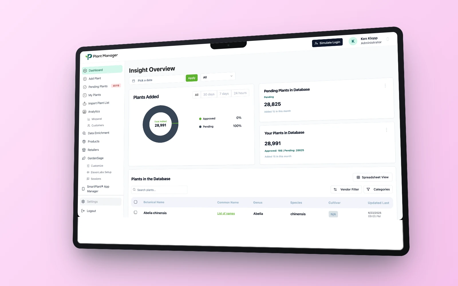
Every project on this site needed a “put the screenshot in a nice laptop” moment, the kind of polished device mockup you’d normally reach for a Figma mockup plugin or a Photoshop PSD template to get. I didn’t have either open. What I had was a browser, some CSS, and Claude Code to take the screenshot for me. Turns out that’s all you actually need. ✦
Here’s the exact technique (code included) so you can drop it straight into CodePen and make it yours.
🎨 The core idea: a bezel is just a styled div
A device mockup is nothing more than a rounded rectangle (the bezel), a smaller rounded rectangle inside it (the screen), and your actual screenshot filling that inner rectangle. No plugin required: just border-radius, a gradient for the metal, and overflow: hidden to keep the screenshot's corners clean.
Here's the laptop version, tilt included:
<!-- HTML -->
<div class="stage">
  <div class="shadow"></div>
  <div class="laptop">
    <div class="notch"></div>
    <div class="screen">
      <img src="your-screenshot.webp" alt="" />
    </div>
  </div>
</div>
/* CSS */
* { margin: 0; padding: 0; box-sizing: border-box; }
body {
min-height: 100vh;
display: flex;
align-items: center;
justify-content: center;
background: linear-gradient(135deg, #ffe3fb, #f6c2ec); /* swap for your own accent */
}
.stage {
position: relative;
width: 90vw;
max-width: 900px;
perspective: 1800px; /* this is what makes the tilt below actually look 3D */
}
.shadow {
position: absolute;
left: 50%;
top: 92%;
width: 70%;
height: 60px;
transform: translate(-50%, -50%);
background: radial-gradient(closest-side, rgba(0,0,0,0.28), transparent 72%);
filter: blur(6px);
}
.laptop {
position: relative;
width: 100%;
aspect-ratio: 16 / 10.2;
background: linear-gradient(155deg, #26282e, #16171b 55%, #0e0f11);
border-radius: 30px;
padding: 1.4%;
box-shadow:
0 60px 110px -25px rgba(0,0,0,0.4),
0 24px 50px -18px rgba(0,0,0,0.3),
inset 0 0 0 1px rgba(255,255,255,0.04);
/* the whole trick lives in this one line */
transform: rotateY(-12deg) rotateX(4deg) rotate(-1.2deg);
transform-style: preserve-3d;
}
.notch {
position: absolute;
top: 1.6%;
left: 50%;
transform: translateX(-50%);
width: 11%;
height: 2%;
background: #0e0f11;
border-radius: 0 0 14px 14px;
}
.screen {
position: relative;
width: 100%;
height: 100%;
border-radius: 14px;
overflow: hidden;
background: #fff;
box-shadow: inset 0 0 0 2px rgba(0,0,0,0.5);
}
.screen img {
width: 100%;
display: block;
}Paste that into a CodePen (HTML in the HTML panel, CSS in the CSS panel), swap the img src for any screenshot, and you have a laptop mockup that's tilted, shadowed, ready to drop into a case study.
📱 The phone version
Same idea, different bezel shape, with a dynamic-island pill instead of a notch, taller aspect ratio, no tilt needed since phones read fine straight-on:
<!-- HTML -->
<div class="phone">
  <div class="island"></div>
  <div class="screen">
    <img src="your-app-screenshot.webp" alt="" />
  </div>
</div>
/* CSS */
.phone {
position: relative;
width: 320px;
border-radius: 42px;
padding: 12px;
background: linear-gradient(160deg, #efe0c8 0%, #cdb894 45%, #a88d63 100%);
box-shadow: 0 40px 80px -20px rgba(0,0,0,0.35), 0 16px 32px -12px rgba(0,0,0,0.25);
}
.phone .island {
position: absolute;
top: 20px;
left: 50%;
transform: translateX(-50%);
width: 90px;
height: 26px;
background: #0a0a0a;
border-radius: 16px;
z-index: 2;
}
.phone .screen {
position: relative;
border-radius: 34px;
overflow: hidden;
background: #000;
}
.phone .screen img {
width: 100%;
display: block;
}🤖 Where Claude Code actually comes in
The CSS gets you the mockup, but you still need a crisp, high-res image out of it for a real thumbnail. This is the part I don't do by hand: I ask Claude Code to open the page in a real browser (via the Playwright MCP), size the viewport to exactly the canvas I want (say, 1600×1000), and take the screenshot. No screen-recording app, no manual cropping. It's the same loop every time: tweak the CSS, reload, screenshot, look, adjust.
That loop is also why I'd genuinely rather do this in code than in a design tool: changing the accent color, the tilt angle, or the bezel radius across eight different project thumbnails is a find-and-replace, not eight manual re-exports.
⚠️ The one gotcha that actually got me
The very first version of this used a soft CSS gradient for the background behind the device, pretty in the browser, but it came out of the screenshot with a visible banding artifact: a hard rectangular patch of slightly different color, like a seam. Compressing a large, perfectly smooth gradient into a lossy image format (WebP, in my case) doesn't always hold up: the encoder can introduce a visible seam where none existed.
The fix was almost embarrassingly simple: use a flat, solid color instead of a gradient for anything large and smooth. It compresses cleanly every time, and honestly looks just as good behind a device mockup. If you only take one debugging tip from this post, take that one.
✨ Make it yours
- Swap the bezel gradient for your own brand's metal: gold, silver, matte black, whatever fits.
- Match the background to your accent palette instead of picking one fixed color for every shot.
- Skip the tilt entirely for a flatter, more front-facing grid of thumbnails; front-on reads calmer than a 3D angle when you have many side by side.
- Stack a laptop and a phone in the same scene (overlapping, bottom-right corner) when a project has both a website and an app to show off.
No plugin marketplace, no PSD you have to hunt down and update every time Apple ships a new phone shape, just CSS you own, that you can tweak in seconds. Go make something look expensive. 🔮