
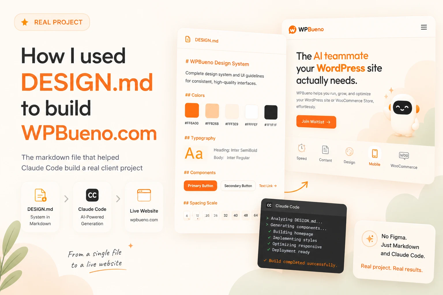
Before I write a single line of UI for a new project, I write a file called DESIGN.md. Not a Figma file, not a moodboard, just a plain markdown file with color tokens, a type scale, component specs, and a “do’s and don’ts” section, sitting at the root of the repo where Claude Code (and I) read it before touching any screen.
I get asked what one of these actually looks like often enough that I want to just show you the real one: this is DESIGN.md from WPBueno, my AI WordPress operator, unedited. ✦
🤔 Why bother with a file instead of just… designing?
Here’s the problem it solves: if you hand an AI coding agent one screen at a time with no shared reference, it will happily invent a slightly different orange, a slightly different border-radius, and a slightly different shadow every single time. Nothing is “wrong” in any one screen, but after ten screens, nothing matches. A DESIGN.md is the one file every prompt can point back to, so “build the site health card” and “build the onboarding modal” come out of the same brand instead of two different ones.
It's based on Google Labs' open design.md format using a YAML frontmatter block of tokens, followed by plain-language sections that explain the reasoning behind them. That second part is the one people skip, and it's the part that actually matters most for directing an AI agent.
🎨 The tokens (YAML frontmatter)
This is the machine-readable part, made up of colors, typography, spacing, corner radii, and named component recipes that reference the tokens above them:
---
name: WPBueno Dash v2
description: Warm, AI-forward SaaS dashboard for WordPress site management. Identity centers on a confident orange primary against warm-white surfaces, with a purple accent reserved for AI/agent moments.
colors:
  # Brand
  primary: "#FF5A12"
  primary-strong: "#FF4E0D"
  primary-ink: "#B33C00"

  # Accent (reserved for AI / token moments)
  accent: "#7A5CFF"
  accent-tint: "#F0EDFF"
  accent-ink: "#4F35BC"

  # Semantic
  success: "#31AA45"
  warning: "#FF9C00"
  danger: "#E78200"

  # Neutrals
  ink: "#121417"
  text: "#23272B"
  border: "#EFE6DD"
  surface: "#FFFFFF"
  surface-warm: "#FFFDF9"

typography:
  display:
    fontFamily: Inter
    fontSize: 28px
    fontWeight: 700
    letterSpacing: -0.025em
  metric:
    fontFamily: Inter
    fontSize: 28px
    fontWeight: 800
    letterSpacing: -0.02em

spacing: { xs: 4px, sm: 8px, md: 12px, lg: 16px, xl: 24px, "2xl": 32px }
rounded: { sm: 6px, md: 10px, lg: 14px, full: 999px }

components:
  button-primary:
    backgroundColor: "{colors.primary-deep}"
    textColor: "{colors.surface}"
    rounded: "{rounded.full}"
    padding: "{spacing.md}"
  ai-badge:
    backgroundColor: "{colors.accent-tint}"
    textColor: "{colors.accent-ink}"
    rounded: "{rounded.md}"
    padding: "{spacing.sm}"
---
Notice components reference tokens by name ({colors.accent-tint}), not raw hex; change the token once, every component that points to it updates. That's the whole point of tokens over hardcoded values.
📝 The part everyone skips: plain-language reasoning
Below the frontmatter, the file keeps going in plain prose. This is the part that turns a color palette into an actual system an AI agent can reason about. From the real file:
## Colors

- **Primary (#FF5A12), "Bueno Orange":** The brand's voice. Used for the
  logo mark, primary CTAs ("Get More Tokens"), the active sidebar item, the
  agent-prompt submit affordance, and KPI accent strokes. Never used for
  body text.
- **Accent (#7A5CFF), "AI Purple":** Reserved exclusively for AI-related
  surfaces: the AI Suggestions card icon, the AI Tasks Completed metric
  icon, the spark emblem. Signals "this content was generated or
  recommended by an agent." Never used for primary actions or decoration.
That single rule (purple means “an agent did this,” nothing else) is worth more to an AI coding agent than a hundred more color tokens. It's the difference between “here are some colors” and “here's what each color is allowed to mean.”
🚫 The highest-value section: Do's and Don'ts
This is the section I'd write first if I only had time for one:
## Do's and Don'ts

**Do**
- Reserve purple accent for AI/agent-related content only. It's a legend,
  not a decoration.
- Use tabular numbers on every metric, percentage, and timestamp.
- Animate state changes 150–300ms with ease-out (entering) / ease-in
  (exiting). Respect prefers-reduced-motion.

**Don't**
- Don't use the orange primary for body text or section titles.
- Don't introduce a third brand hue; green/orange-warning are semantic,
  not brand.
- Don't put glassmorphism, neumorphism, or gradients on data cards. The
  product reads as paper.
Every one of those is a mistake an AI agent (or a rushed human) would otherwise make at least once. Writing them down once is cheaper than correcting them ten times across ten screens.
🔗 From one file to a whole project
The reason this is worth the twenty minutes it takes to write is the pipeline it unlocks. For WPBueno, the actual workflow is:
DESIGN.mdat the repo root is the canonical source of tokens.- The static landing page gets built against those tokens first: fast to iterate, no build step, good for validating messaging with stakeholders before touching real code.
- Once the direction's validated, tokens export straight to Tailwind:
design.md export --format tailwind DESIGN.md > app/tailwind.theme.json - The real Next.js app consumes that generated theme file (same tokens, zero drift).
- A Storybook design system in the app gets built against the same tokens, so every component (button, card, status pill) is documented and visually testable on its own.
One file, five surfaces (landing, app, Storybook, and every prompt in between) that can't quietly drift apart from each other.
✨ Writing your own
- Start with one primary color and write down what it's for, not just its hex.
- Keep semantic colors (success/warning/danger) explicitly separate from brand colors; don't let an AI agent reach for "warning orange" when it means "brand orange."
- Name real components you're actually going to build (
kpi-card,agent-prompt-card) instead of generic ones, since specificity is what makes it useful mid-project. - Write the Do's and Don'ts section like you're leaving notes for a very capable junior designer who's never seen the brand before. Because that's exactly who's reading it.
Go write the one file that keeps your next project from looking like it was designed by committee, even when the “committee” is just you and an AI agent, moving fast. 🔮