
Landing Page · Interaction · Explainer Video
MyGardenSage✦
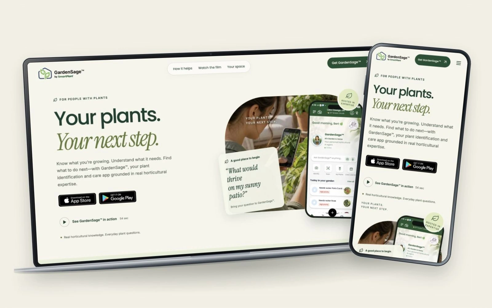 FROM INTENTION TO INTERACTION.
A little story. A clearer next step.
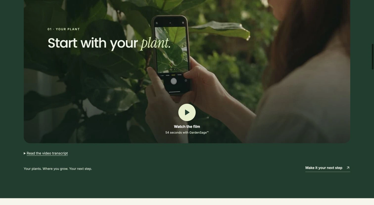
I also created the GardenSage explainer, bringing the product story into motion as part of the landing experience. Watch the film featured on the live site.
A problem
worth solving.
A first-time visitor may have a plant in front of them, an empty patio or a care question they cannot quite describe. The landing page needs to connect that everyday situation to GardenSage quickly, without turning the introduction into a feature catalogue.
This is a dedicated consumer landing, separate from SmartPlant’s wider website. Its job is to make the app approachable, explain the guidance through tangible examples and keep the download path clear on desktop and mobile.
Intentional at
every turn.
- 01
Paired the central promise—your plants, your next step—with a real app screen and a recognizable gardening scene.
- 02
Placed the product film near the opening for visitors who prefer to see the experience before reading further.
- 03
Built a two-state feature explorer around identifying a plant and asking a question, keeping the screen and its explanation together.
- 04
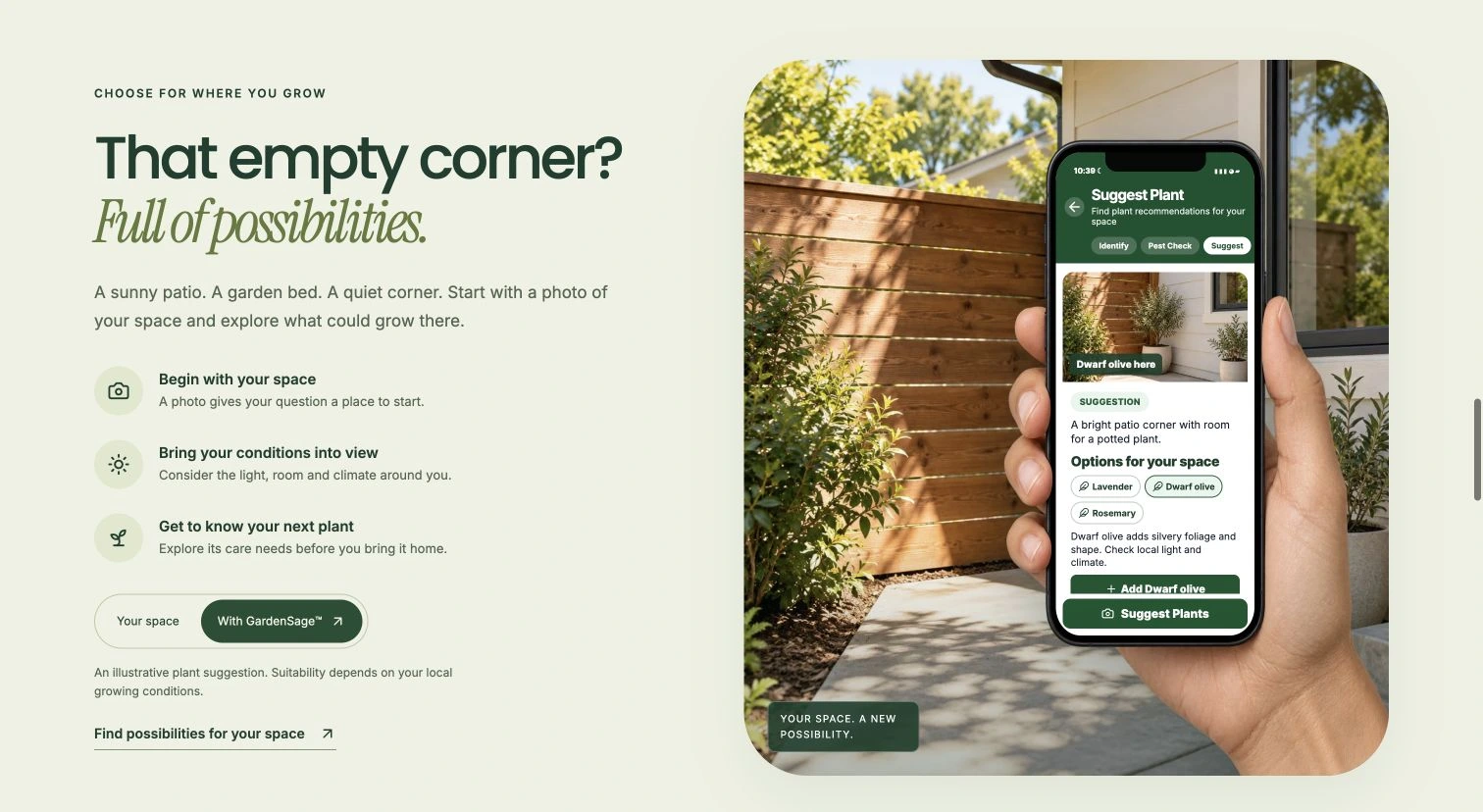
Used an empty-patio comparison to make spatial plant recommendations concrete. The planted result is presented as an illustrative possibility.
- 05
Repeated the download invitation at natural decision points while preserving a calm reading rhythm and a clear mobile hierarchy.
One connected journey.
- 01
Recognize your question
An everyday growing situation creates an approachable starting point.
- 02
Watch or explore
Watch the film
See GardenSage in a short product introduction.
Try the feature explorer
Switch between plant identification and question-led guidance.
- 03
Imagine your space
Compare an empty patio with an illustrative planting idea.
- 04
Get GardenSage
Continue to the iOS or Android app.
Made to work.
Crafted to feel.
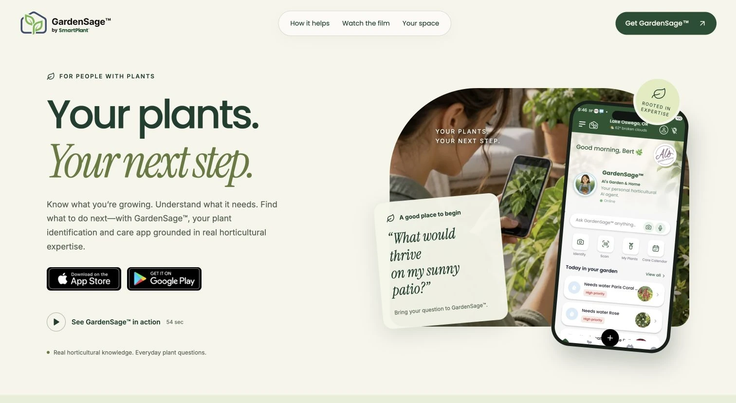
Your plants. Your next step.
A focused hero balances the product promise, app imagery, a familiar question and direct links to both app stores.
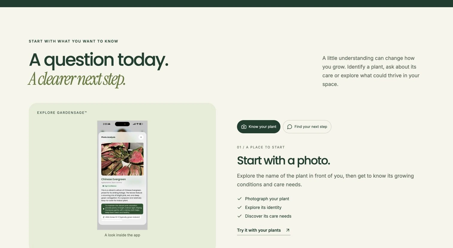
Start with a photo
The feature explorer pairs a real identification screen with the three practical steps a visitor can take.
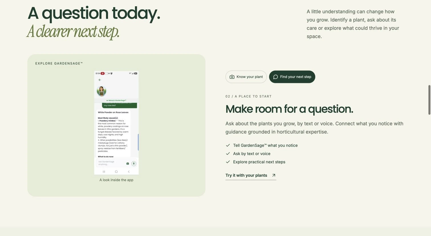
Make room for a question
Switching tabs reveals question-led guidance and explains how text or voice can become a useful next step.
Begin with your space
An empty patio gives the recommendation story a concrete starting point.
See a possibility
The companion view illustrates how a suggested plant could fit the same corner. The interaction makes the difference visible without presenting the visualization as a guaranteed result.
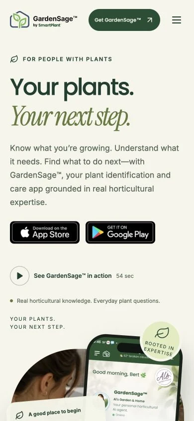
A clear next step on mobile
The responsive landing keeps the main promise, app-store choices and film invitation within a compact reading flow.
GardenSage App
Mobile App · AI Product · UX/UI